So tonight is my last night in NY. My last day at Blue Sky was Friday , and after a full weekend of saying some pretty heartfelt goodbyes , I'm driving back across country,home to Seattle. The exact opposite if what I did two years ago ! Man time flies! I'll be taking October off, spending some time with friends and family, and after that I start at Disney on Nov 7th ! I feel really lucky to have had this experience at Blue Sky. I met some amazing people, made some really fantastic friends and I really grew to love the area, especially NYC. I'm going to miss it so much. Best of luck to everyone on finishing up Ice Age 4.
It was awesome to get to share some experiences with you guys and gals, thanks for following along and I hope to do the same when I get to Los Angeles!
See you then and
Take care everyone !!
Bobby's LA Journal
Monday, September 19, 2011
Friday, September 16, 2011
Thursday, September 15, 2011
Pete Paquette
Continuing with the "Awesome people I got to work with" series, Today's is Pete Paquette.
Pete's Rio Reel
Wednesday, September 14, 2011
Garrett Shikuma
As my time at Blue Sky & in NY comes to an end, so will the entries in this blog. But before it concludes, I wanted to introduce you to some of the super talented artists/animators I have had the pleasure to learn from during my time here!
First up : Garrett Shikuma !
Shikuma's caricatures
Tuesday, September 6, 2011
Design Presentation
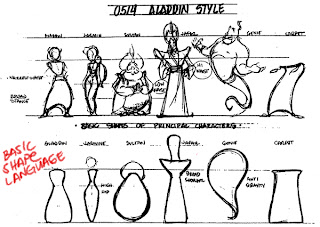
A few weeks ago I was asked to give a presentation on Character Design to the Animation team here at work!
Let me first say that I don't, by any means, consider myself an expert in the field, and approaches/opinions on design vary wildly. So this was , essentially, just my humble outlook on the artform, and is based on my personal design aesthetic (what I like.) So here are the images I went through during my talk.
If I have some time I hope to give these images some actual context with what I was saying, but I just wanted to post these images us, hopefully they mostly speak for themselves.
If I have some time I hope to give these images some actual context with what I was saying, but I just wanted to post these images us, hopefully they mostly speak for themselves.
"Personality usually dictates design, so I consider Silhouette, Shape , Proportion, and Pose."
-Joe Moshier, Dreamworks Character Designer
Art by Shannon Tindle
Art by Daniel Lopez Munoz
More examples of circles vs squares (straights vs curves):
Art by Ricky Nierva
Art by Jay Shuster
A lot of times Nico Marlet works with one broad shape and the details are subservient .
Art by Nico Marlet
Art by Nico Marlet
Art by Carter Goodrich
Art by Joe Moshier
Art by Nico Marlet
Art by Norman Rockwell
Art by Bobby Chiu
Art by Milt Kahl, Breakdown by Mark Kennedy
Art by Chuck Jones
Art by Nico Marlet
Art by Shane Prigmore
Breakdown by Xavier Ramonede
-----The Way I work. Well, one of the ways.-----
Subject research
What I want to emphasize
Thumbnail , done tiny tiny
Thumbnail blown-up
Shape Breakdown
Flow Breakdown
Clean Line
Flat Color
Simple Render
And that's all I had! Feel free to drop me a line you wanna talk shop if some of this doesn't make sense!
Bobbypontillas (at) Gmail (dot) com
AnimSchool
Check out this promotional video for AnimSchool, a new online animation school started up by Dave Gallagher, an amazing animator and rigger who used to work with us here at Blue Sky. The clip has a lot of AMAZING animation done by friends here, some of whom will also be mentoring at the school. My only contribution was the "Milt, Frank, and Ollie" portrait at : 048.
Subscribe to:
Comments (Atom)


